Jagz
Industry
Food & Drink
What We Did
Made in our world, enjoyed in yours
For Jagz Beer Garden, a family-owned business dedicated to curating a welcoming and inclusive atmosphere, we crafted a logo system and brand aesthetic that reflect its community-driven mission. The brand aims to be more than just a place to enjoy great beer—it’s a gathering spot where individuals from diverse backgrounds can come together, exchange ideas, and learn from one another. The visual identity we developed mirrors this ethos, combining warmth and openness with a touch of sophistication, symbolizing the garden's role as a bridge between communities. Through thoughtful design and branding, we reinforced Jagz Beer Garden’s commitment to fostering understanding and unity.
In our branding, we crafted an iconic mark that not only identifies the brand's industry but also reflects its ethos of quietly working in the background to enhance the experience of its patrons. This understated yet powerful identity is rooted in the brand’s deep commitment to the community it serves—individuals who seek meaningful, unobtrusive support in their pursuits. By focusing on efficiency and reliability, the brand ensures that their customers can focus on their passions while the brand operates seamlessly behind the scenes. This dedication to service and community is woven into the very fabric of their visual identity, creating a mark that is as purposeful as it is iconic.

Iconic Brandmark
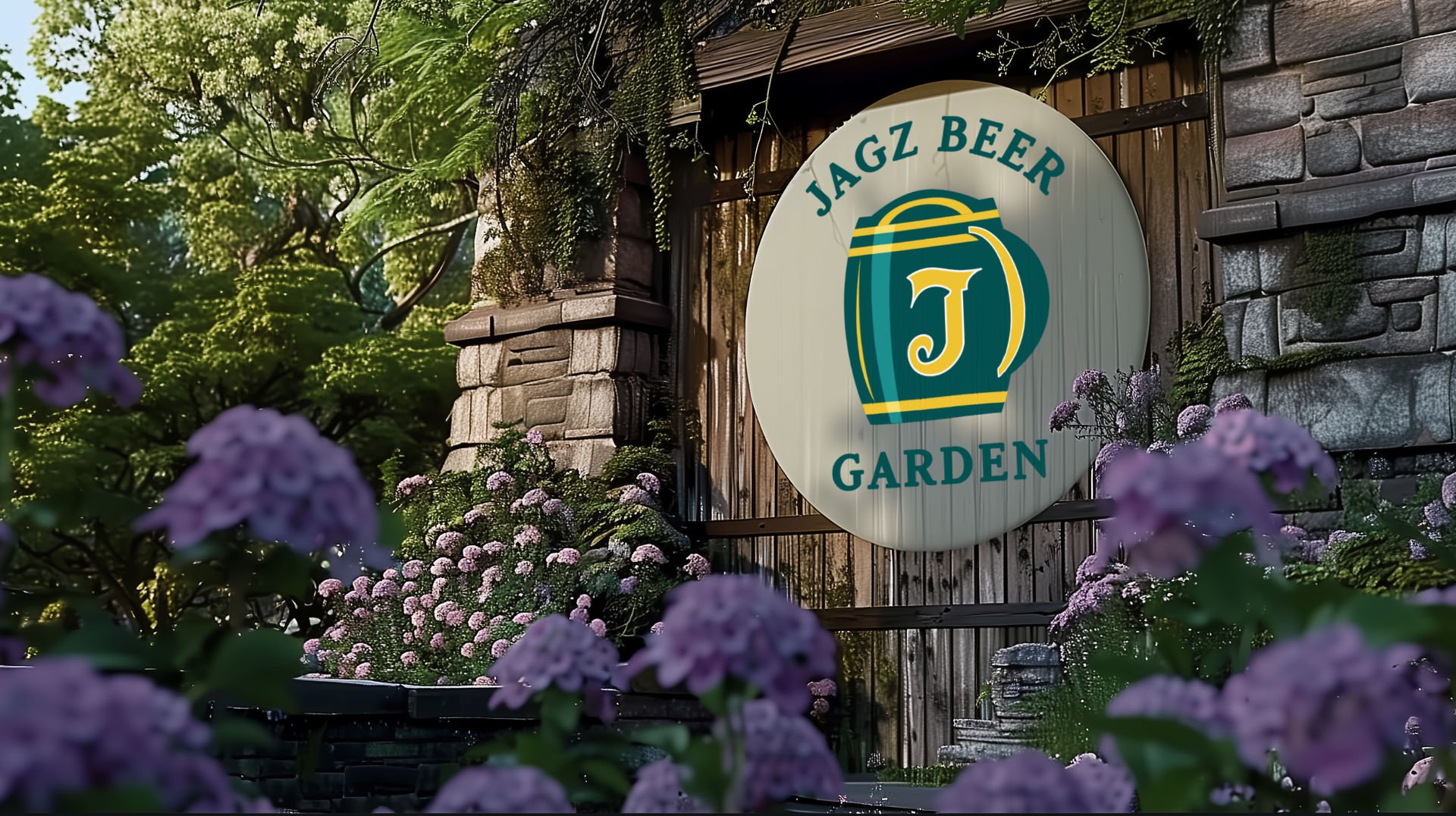
The brand mark we developed is designed to effortlessly communicate the industry while avoiding tired clichés. At its heart, the mark is a thoughtfully crafted monogram, featuring an iconic beer mug with a subtly off-centered, stylized "J." This asymmetry adds character to the design while maintaining a balanced and cohesive visual. The "J" itself is intentionally unanchored to any specific cultural reference, allowing the brand to craft its own story and mythology around this symbol. Instantly recognizable as a nod to beer culture, the mark stands out with a distinctive identity that feels fresh, authentic, and wholly unique.
A Versatile Mark
In the alcohol industry, it's essential to have a brand mark that can seamlessly transition between light and dark settings, as branding often appears in varied environments like dimly lit bars or bright outdoor spaces. For this project, we paid careful attention to color selection and design choices, crafting a logo that performs beautifully in both light and dark versions. Through subtle adjustments and a thoughtful palette, the brand mark retains its integrity and impact, requiring only minimal tweaks to maintain legibility and visual appeal. This flexibility ensures the logo stands out, whether it's showcased in vibrant daylight or against the backdrop of a cozy, low-lit venue.
Our World and Yours
The aesthetic branding is built around the tagline, “Made in our world, enjoyed in yours,” reflecting a seamless connection between authenticity and artistry. The visuals are crafted to feel grounded and natural, yet subtly elevated, offering a sense of familiarity that resonates with the audience. What makes this approach distinctive is the thoughtful integration of the unexpected or delightful—a detail that catches the eye or a composition that surprises. These elements transform everyday moments into something memorable, bridging the brand’s world with the audience's, making each interaction feel both personal and special.
